Why rooms that look good alone can still clash
Most homeowners choose finishes one room at a time. A kitchen gets its tile, a bathroom gets its own palette, and a bedroom gets whatever color felt calm in the showroom. Each decision makes sense in isolation, yet the result can feel like several different houses stitched together at the doorways.
The problem is rarely one wrong color. It is usually a lack of repetition. When no material, tone or detail appears in more than one place, the eye has nothing to follow, and the home reads as a collection of separate projects instead of a single plan.
Flow does not mean sameness. A bathroom can be quiet and cool while a living room is warm, as long as a few shared decisions tie them together. Those shared decisions are what this guide helps you identify before you order anything.
A useful test is to photograph each finished room from the doorway and then lay the photographs side by side. If you can tell which house each picture belongs to, the flow is working. If one room looks like it came from a different home, look for what it lacks: a repeated floor tone, a matching trim color, or a shared metal finish that would connect it to its neighbors.
Start with the sight lines, not the room list
Stand in your front door, then in the middle of the main living area, then at the end of each hallway. Whatever you can see from those spots belongs to one visual field, and the finishes in that field need to get along. A kitchen that is visible from the sofa is part of the living room whether or not a wall is drawn between them.
Make a simple sketch of your floor plan and mark the sight lines with arrows. Wherever an arrow crosses a doorway, note what is on each side: floor material, wall color, trim style, door finish. Those crossing points are where most flow problems show up, so they deserve your attention first.
If you are considering removing a wall or widening an opening, sight lines change dramatically. Our page on open concept kitchen conversions explains how a larger opening pulls adjoining rooms into the same view, which makes the finish conversation even more important.
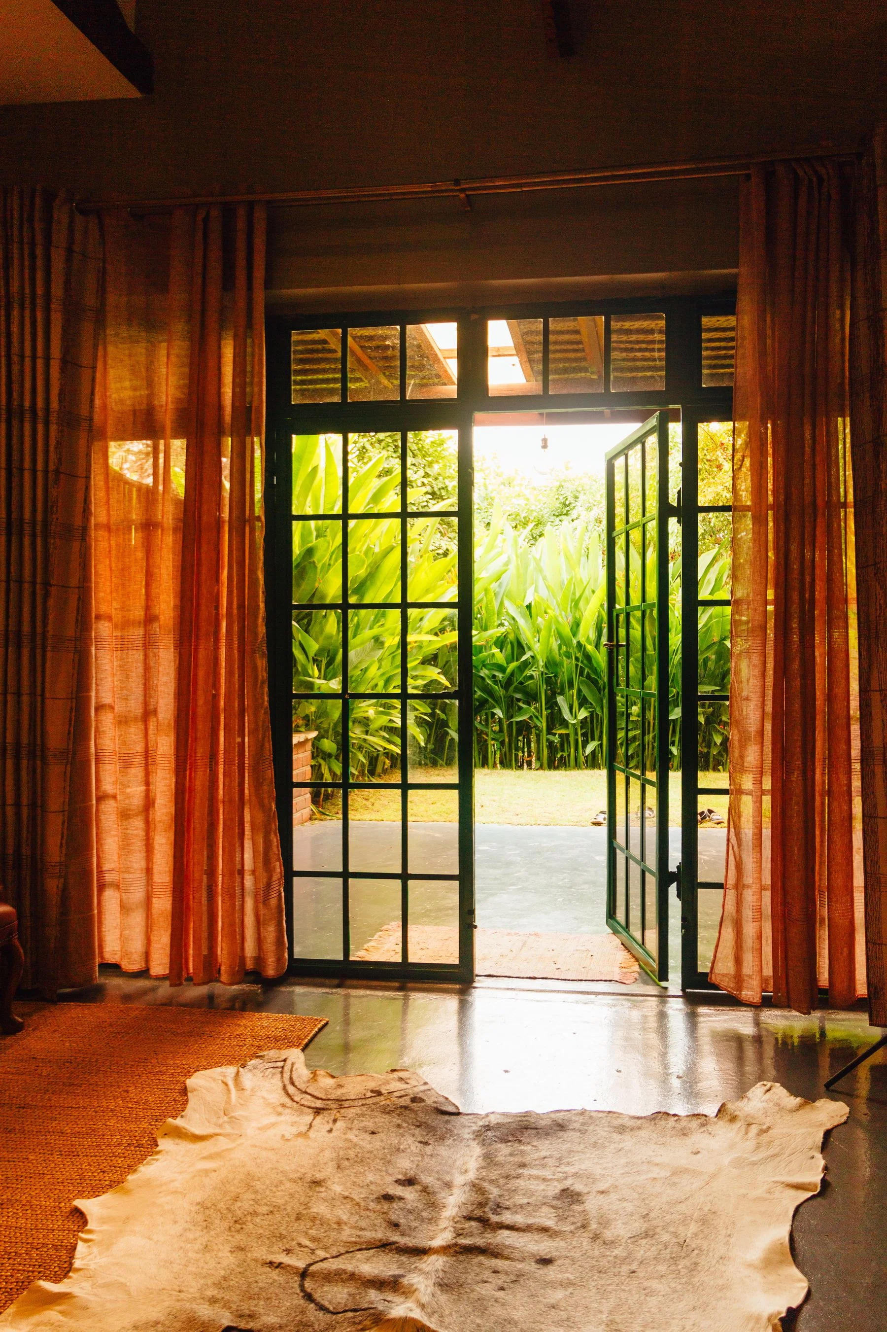
Do not forget the views through windows and glass doors. A patio, a pool deck or a garden is also part of the sight line, and the colors outside influence how the colors inside feel. Natural stone, painted stucco and greenery all contribute, and a calm interior palette often looks right when it borrows a tone or two from what is visible beyond the glass.
Flooring is the thread that holds everything together
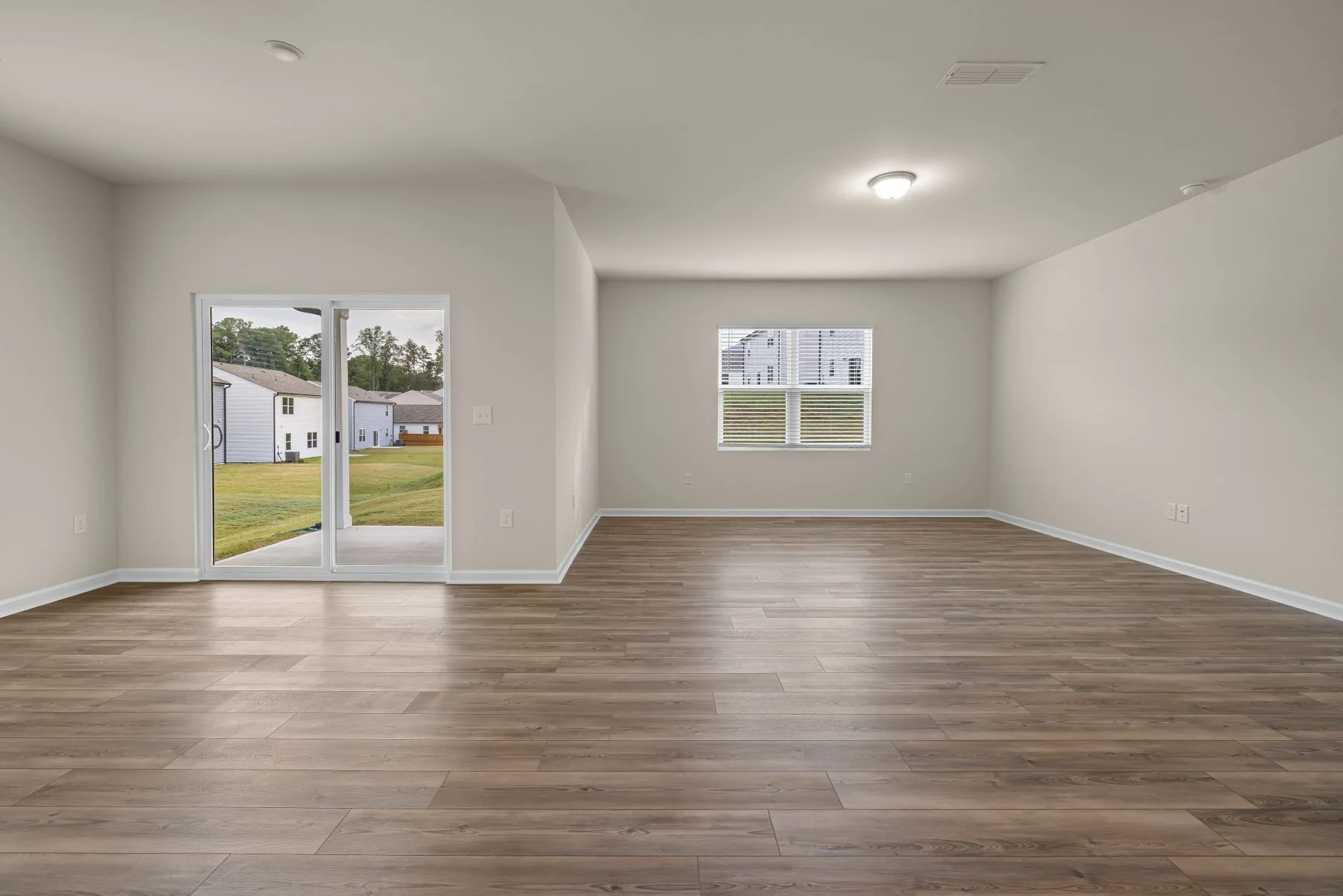
Floors cover more visible area than almost anything else in a home, so they set the tone for every room they touch. Using one flooring material through the main living spaces gives you a continuous base, and then paint, tile accents and fixtures can vary without the house feeling chopped up.
When different floors are needed, the transition is where flow is won or lost. Tile in wet areas and wood look planks in living areas can sit side by side nicely if their tones are related and the meeting line is planned, not improvised. Uneven or damaged tile transitions show what goes wrong when height differences and edge details are left to chance.
Think about the species, plank width and undertone as well as the color name. Two floors both called gray can look cold and warm side by side. Always view samples together, in the actual light of your home, before deciding that two materials belong in the same sight line.
Practical details matter as much as appearance. Floors that meet at a doorway should sit at compatible heights, and the edge profile you choose affects how clean the line looks. Ask your contractor how the transition will be built, whether the subfloor is level enough for the new material, and what preparation is part of the written scope, since a beautiful floor laid on an uneven base will never look continuous.
Choose a small palette and repeat it
A workable whole home palette is usually three or four decisions: a main wall color, a trim color, a floor tone, and one or two accent materials such as a metal finish or a stone. You do not need to use all of them in every room, but each room should use at least a couple of them so the palette is visible everywhere.
Repetition can be quiet. The same trim white in every room, the same door finish on every interior door, or the same hardware color on cabinets and doors all count. These small echoes are what visitors feel as calm and intentional even when they cannot say why.
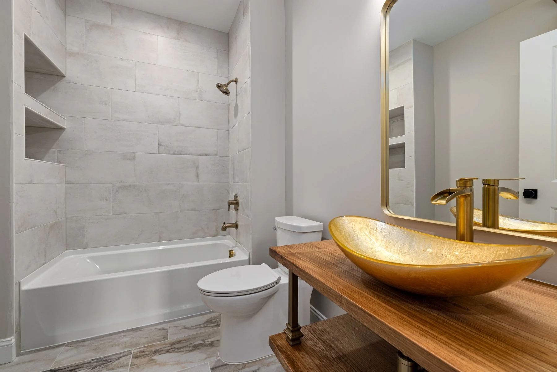
Accent rooms are welcome. A powder room, a study or a laundry space can carry a bolder wall color because it is entered through a door and read on its own. Keep the trim, ceiling and flooring family consistent, and the bold choice will feel like a deliberate moment instead of an accident.
If you are unsure where to begin, start from something you already love and cannot change, such as a piece of furniture, a rug or a view. Pull the main tones from it, and build the palette outward. A palette that begins with a real object is easier to defend later, when a showroom sample tempts you in a different direction.
- Pick one main floor tone and let it appear in every shared living space.
- Use a single trim color and profile throughout the whole home.
- Repeat one metal finish across hardware, lighting and plumbing fixtures where rooms can be seen together.
- Keep ceilings consistent and let walls carry the variation.
- Reserve bold color for rooms that are enclosed by doors.
Undertones: the detail that quietly breaks a palette
Every neutral has an undertone. Whites lean cool or warm, grays lean blue, green or violet, and beiges lean pink or yellow. Two neutrals that look identical on separate sample cards can fight each other once they are on adjacent walls, especially next to a floor with its own undertone.
The most reliable method is to compare samples together, large enough to see, and left in place for a few days across morning, afternoon and evening light. South Florida sun is strong and bright, and it changes how colors read compared with a showroom or a lamp lit sample.
If you have existing items you will keep, such as a countertop, a stone fireplace or an older tile, treat them as fixed. Match new finishes to the undertone of those fixed items, not the other way around. Paint sheen also helps, because sheen changes how much a color reflects and how its undertone shows.
When you are down to two close candidates, ask for a sample painted on a board and moved around the room, rather than painted directly on the existing wall. A board lets you see the color against the floor, the trim and the window at the same time, and it can be removed without leaving a patch. Your painter can also tell you how many coats a given color usually needs, which affects the written scope.
Trim, doors and hardware are the connecting tissue
Trim is the frame around every view. Baseboards, casings and crown give a home its visual rhythm, and when profiles or colors change from room to room, the house loses that rhythm. Choosing one baseboard height and style for the entire home is one of the least expensive ways to create flow, and it is easy to plan when the work is done together.
Interior doors work the same way. A mix of door styles, panel patterns and finishes along one hallway looks busy. Our guide to door styles and hardware walks through how to pick a style that suits the whole home, and the service page for interior doors and trim explains how replacement and installation are planned.
Hardware is the jewelry. Handles, hinges, switch plates and cabinet pulls do not need to match exactly, but they should come from one family of finishes. If you choose satin nickel in one room and aged bronze in the next with no connection, the transition reads as a mistake.
Window and door frames deserve the same thought. White frames, bronze frames and wood grain frames all frame a view differently, and in a home with large glass openings they become a major part of the palette. Our page on impact window installation explains how openings are planned, and frame color is a good question to settle before the order is placed.
Lighting changes everything you picked
A finish chosen under bright store lighting can look completely different at home. Warm bulbs deepen woods and turn white walls creamy, while cooler bulbs flatten wood tones and make grays look icy. If different rooms use bulbs of different color temperatures, the same paint can look like two different colors from room to room.
Plan the lighting and the finishes together. Choose one color temperature for the main living areas, and use warmer or cooler light deliberately in places where the mood should be different. Our guide on interior lighting layers explains how ambient, task and accent light work together, and recessed lighting layouts follow the same logic when fixtures are placed.
Natural light matters as much as electric light. West facing rooms warm up in the afternoon, and north facing rooms stay cooler all day. Look at your samples in each room at different times, and be willing to adjust the same color slightly in a darker room so it appears consistent with the brighter rooms.
Dimmers are a simple way to keep this under control. A room that can be lowered in the evening and brightened for cleaning will show its colors well across more situations. Ask your electrician and contractor which switches and fixtures can be dimmed, and plan that before the walls are closed, because changing wiring later is far more disruptive than choosing it during the work.
Planning flow for a multi room project
When several rooms are renovated together, you have the rare chance to make every decision in one pass. Gather your selections in one place, view them together, and check each room against the sight line sketch. This is far easier than trying to match a new bathroom to a floor you installed two years earlier.
If budget or life requires phasing the work, decide the whole home palette first and build it room by room over time. The first phase should establish the shared materials, such as flooring and trim, so later rooms have something solid to connect to. Our planning page on multi room project phasing covers how to order the work, and the page on whole home renovation describes how the scope is organized when everything is done together.
Keep a written list of every selection with its name, color code and where it is used. When a paint touch up or a replacement tile is needed later, you will be glad you can find the exact product. A contractor can attach the list to the written scope, so it becomes part of the project record instead of a memory.
Budget conversations belong here too. Repeating a material across many rooms can simplify ordering and make the work more orderly, but a premium finish used everywhere adds up. Decide where the eye lands most often and invest there, then choose simpler versions of the same tone for closets, laundry areas and secondary rooms. The page on budget conversation planning can help you frame it.
Humidity, salt air and the materials you repeat
Consistency is also practical. In a hot, humid climate with salt air near the coast, some materials hold up better than others in certain rooms. When you repeat a durable material through the home, you repeat its performance as well as its look. Our guide on salt air and home materials explains what to consider before you commit.
Wet rooms may need a different surface than dry rooms, and that is where a deliberate transition helps. A bathroom floor tile can share a tone with the hallway wood look plank, even though the materials are different. Tile selection is covered in the guide to choosing tile for Florida homes.
Do not let flow push you into a poor material choice. If the ideal floor for the whole home is not suited to a particular room, change the material and keep the tone. A good contractor will tell you where a repeated finish makes sense and where it does not, and will put that advice in the scope.
Condos and townhomes add another layer. Shared walls, building rules and association standards can limit what you change, from flooring underlayment to exterior door colors. Ask your association what applies before you fall in love with a finish, and see our guide to condo renovation rules for the kinds of questions to bring to them.
Walk the house before you sign off on selections
Before ordering, lay all the samples on the floor of the central room and look at them together. Then carry them room to room and set them against each wall. Take photographs in the morning and the late afternoon. If something feels off in one photograph, trust that feeling and revisit it before the material is cut, tiled or painted.
Ask your contractor for a written selections sheet that matches the scope. Our guide to selecting fixtures and finishes shows how to organize this, and lead times and ordering questions remind you to ask early about availability so a backordered item does not force a hurried substitution that breaks your palette.
Keep leftover materials. A spare box of floor, a labeled can of each paint color and a few extra tiles give you matching stock for repairs. Ask your contractor to hand them over at the end and to note where each paint was used, so future touch ups blend in with the original work.
At the end of the project, walk the home from the front door to the back with your contractor, looking at transitions as well as individual rooms. If a color or edge needs adjusting, it goes on the punch list. For a well run finish, see punch list and final walkthrough for what to expect.
Common questions
Do all the rooms in my home need to use the same paint color?
No. Rooms can use different wall colors as long as a few elements repeat, such as trim color, ceiling color, flooring tone and hardware finish. Those shared decisions create flow. A single bold room is fine when it is closed off by a door and the surrounding materials stay consistent.
Should I use the same flooring in every room?
Not necessarily. Using one material through the main living areas gives a strong base, but wet rooms and utility areas may need something different. When the material changes, keep the tone or undertone related and plan the transition line carefully so the change looks deliberate.
How do I check whether two neutrals will look right together?
Put large samples side by side on the actual walls and floors, and leave them for several days. Look in morning, afternoon and evening light, and under your real bulbs. Undertones often show only when colors are next to each other, so never judge a neutral from a single small card.
Is it a problem if my kitchen and bathroom use different metal finishes?
Not if the rooms are separated and not seen together. When two spaces share a sight line, mixed metals can look accidental. A safe approach is to pick one main finish for the whole home and use a second only as a small, repeated accent in a few places.
What should I decide first when planning flow for several rooms?
Decide the flooring and trim first, since they are the most continuous elements and the hardest to change later. Then choose wall colors and fixtures to suit them. Writing the selections into the scope helps your contractor order and install everything consistently across the project.
Can I phase a whole home palette over a long period?
Yes, if you set the palette up front and build the shared materials first. Keep a written selections list with names and color codes, so later rooms match. Ask about product availability each time, because a discontinued item can break a palette that was planned well.